Theme Druxt components
Change Druxt component output with wrapper components, the default template, slots and props, without forking or patching the framework.
Before you start: this guide assumes a working Druxt site (see Getting started). It also helps to have read Component resolution for why the suggestion chain works the way it does.
Druxt components are themed two ways: a wrapper component placed at a conventional path, or the default template passed inline. Wrappers are the Drupal-template-suggestions of Druxt; the default template is the quick inline override.
Theme with a wrapper component
Everything follows from one rule: the file path is the component
name. Nuxt auto-imports everything under components/, turning the
path into a PascalCase name, and Druxt renders the most specific name
that exists. The file starts working the moment it is saved.
-
Render a Druxt component:
<Druxt module="entity" :props-data="{ type: 'node--article', uuid: page.uuid }" /> -
Create a wrapper at the path that spells the suggestion you want to own. To theme every article in the default display:
<!-- components/druxt/entity/node/article/Default.vue --> <!-- Auto-imported as DruxtEntityNodeArticleDefault --> <template> <div> <h1>{{ entity.attributes.title }}</h1> <slot /> </div> </template> <script> export default { props: { entity: { type: Object, required: true }, }, }; </script> -
Reload. The entity now renders through your wrapper: your markup, the module's data, arriving as props.
Each module passes its own props (entity here; a block wrapper gets
block, and so on), and anything you do not declare as a prop is still
available on $attrs. Declare what you use, as above, so the template
reads plainly.
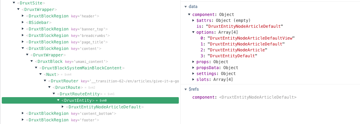
Find the right wrapper name
The full candidate list for any component on the page is in its
component.options data, visible in
Vue devtools. In development mode, DruxtBlock and
DruxtField also print the list in the debug box described below,
with a Create button that scaffolds the file for you. If no candidate
matches, the plain DruxtWrapper default output renders, so a site
with no wrappers still works.
- Full lookup order and naming rules: Component resolution.
- Base class details: DruxtModule API.
Default template
Most Druxt modules accept an inline default template, giving full control of the default slot without creating a file. The template scope receives the same data the module would pass a wrapper:
<DruxtEntity v-bind="props">
  <template #default="{ entity }">
    <div>
      <h1>{{ entity.attributes.title }}</h1>
    </div>
  </template>
</DruxtEntity>
A component with a default template skips the wrapper system. To have
both, set the wrapper property:
<DruxtBlock v-bind="props" :wrapper="true">
  <template #default="{ block }">
    <!-- Wrapped by a DruxtBlock wrapper component. -->
  </template>
</DruxtBlock>
"Missing Vue template" box
Two components, DruxtBlock and DruxtField, opt into a dev-mode debug box
when nothing themes them yet. For a block you'll see:
Missing Vue template for the 'umami_search' block
For a field, the wording differs slightly (Missing Vue template for '<schema.id> (<schema.type>)'), since each component authors its own
fallback rather than inheriting one from DruxtModule. Other modules don't
currently have this box at all; a missing wrapper there just renders the
plain DruxtWrapper default output described above, with nothing to expand.
Either way, this is expected, not an error, and it only renders when Nuxt
is in development mode ($nuxt.context.isDev); production builds show
nothing there instead. Expand it and you'll find a dropdown of every valid
wrapper name for that component (from component.options, the same list
described under Find the right wrapper name above) plus a Create
button that scaffolds the file for you, wrapper path already filled in.
Where to go next
- Component resolution: the naming rules behind the wrapper system.
- Build your first custom module: the same mechanism from the module author's side.
- Debug Druxt with the Vue Devtools: inspect
component.optionslive.