Browse and develop components in Storybook
Storybook stories generated from live Drupal data, with a story tree that mirrors your backend and controls driven by real content.
Before you start: this guide assumes a working Druxt site (see Getting started) with its Drupal backend running. The stories are generated from what the backend serves.
Druxt generates Storybook stories from your Drupal backend at startup: your blocks, content types, menus and views become a browsable component workshop with no story files to write. There is nothing to keep in sync, because the stories are read from the same JSON:API the site renders from.
Set up Storybook
-
Install the Nuxt Storybook module on the 4.x line. Majors 5 and later require Nuxt 3, which this stack does not use:
npm i -D @nuxtjs/storybook@4The module bundles
@storybook/addon-essentialsat the matching Storybook 6 version; do not add addons unversioned, since current majors require Storybook 10. -
Run it (on Node 17 or later, prefix with
NODE_OPTIONS=--openssl-legacy-provider, as for any build in this stack):npx nuxt storybook
Storybook opens on port 3003 with a story tree generated from the backend.
What gets generated
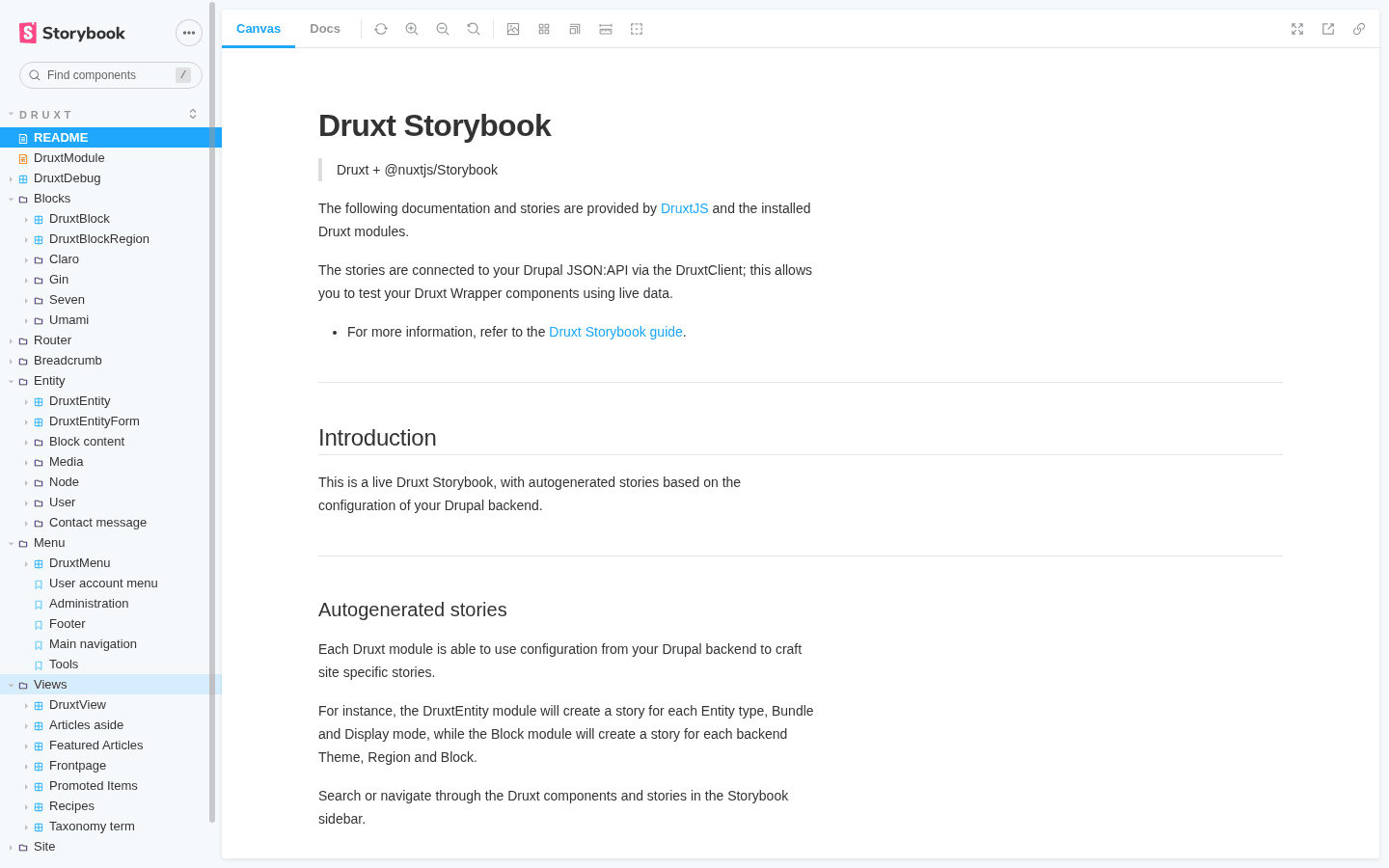
Each installed Druxt module registers its own stories at startup:
| Group | Generated from |
|---|---|
| Blocks | Every block placement, grouped by the backend's themes, plus DruxtBlock and DruxtBlockRegion |
| Entity | DruxtEntity and DruxtEntityForm, with a group per entity type and bundle, one story per display mode |
| Menu | One story per Drupal menu (main navigation, footer, and the rest) |
| Views | One component per view, with its displays |
| Router, Breadcrumb, Site | The wildcard router, breadcrumb and site-scaffolding components |
The tree mirrors your backend. Place a block or create a content type in Drupal, and after a Storybook restart its story is there.
Work a story
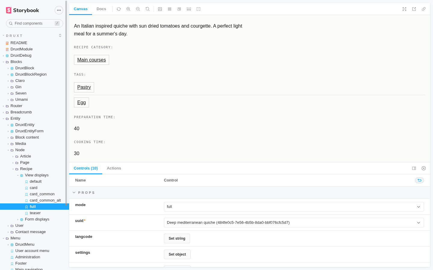
Every story renders through the same components the site uses, against live data, and the Controls panel exposes the component's props. Entity stories list real entity ids in a dropdown, menu stories take depth and langcode, and block stories offer the placements the backend actually has. Flip a control and the component re-renders with real content, which makes Storybook the fastest way to answer "what does this display mode look like" without building a page.
The Docs tab on each component collects its props and stories on one page. It comes with the bundled essentials addon.
Develop a theme component in isolation
The workshop loop pairs with theming:
- Open the story for the thing you are theming, say a content type's
carddisplay. - Create the wrapper file at its suggestion path
(
components/druxt/entity/node/article/Card.vue). - The story hot-reloads through your wrapper as you edit, with the entity controls there to switch between real entities.
The wrapper gets styled against every real variant of the content the backend holds.
Publish it
nuxt storybook build writes a static Storybook
(by default to storybook-static/), deployable to any static host like any other
build output. The stories still make live requests, so Drupal must
allow the Storybook origin through CORS when
it is served from a different origin. The Umami demo publishes its Storybook at
umami-storybook.druxtjs.org,
which is this whole page in live form against the Umami demo content.
Where to go next
- Theme Druxt components: the wrapper system the stories exercise.
- Component resolution: why the suggestion paths look the way they do.
- Deploy a static site: the same hosting story the built Storybook uses.